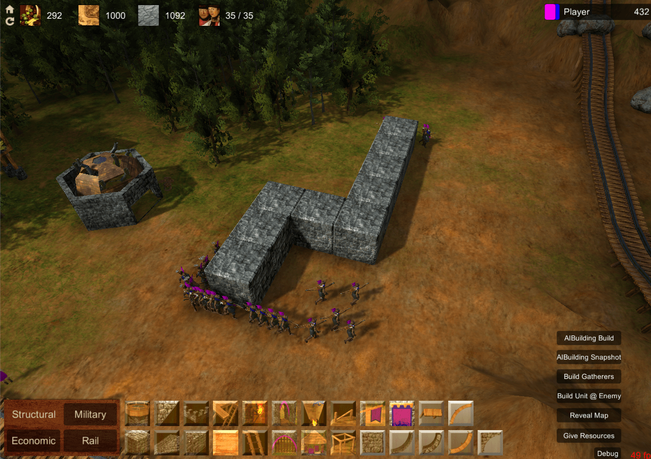
Recently I’ve been play testing more often, and I’ve been playing more games with people who are new to the game. Overall it’s been a really rewarding experience to see people getting having so much fun, laughing and yelling at each other while playing the game. I keep getting asked when the next play test will be!
It’s also been really good for identifying things that are unclear, frustrating or not matching player’s expectations.
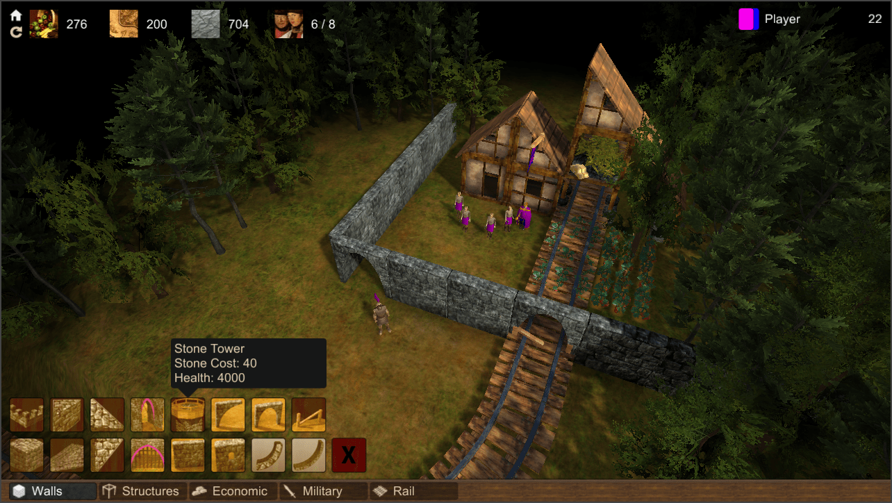
Some types of building blocks need to have connections to other blocks in order to make things work. For example, hydrogen pipes are used to pipe hydrogen gas into buildings that can use it. Railway tracks also need to connect with each other to allow trains to travel between them.
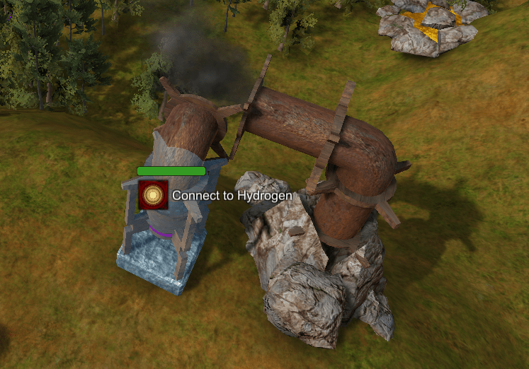
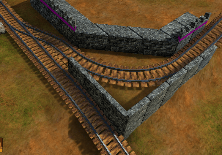
I found that hydrogen and rail units weren’t being used very much, even though they have cool abilities. The reason was that players found it frustrating to build connections piece by piece. It takes a lot of time, and meanwhile players still need to focus on attacking and defending. This is especially true for hydrogen pipes because they can move freely through 3D space.
I think this kind of mechanic adds depth to the building aspect of the game, but I wanted to make it easier and faster for players to build what they want. To do this I decided to add an assist feature that finds a path between the start and end points selected by the player.
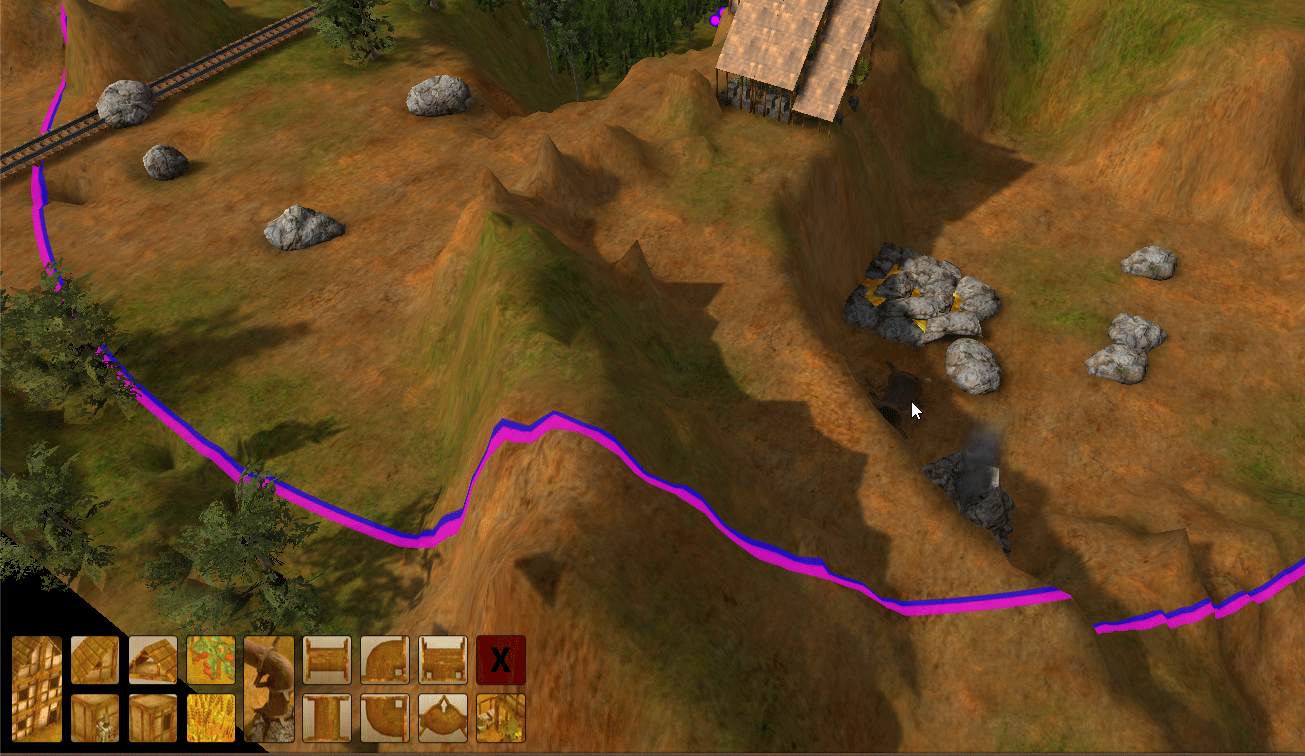
UX wise, I’m using double height buttons to visually distinguish buttons that build many building blocks at once, while single height buttons build a single building block. The player clicks once to set the start point, and then moves their mouse to the end point while seeing a preview of what will be built.
To implement the feature, I used A* to search for a path between the start and end points. I already have an A* implementation for unit pathfinding, but it’s optimized for very different conditions. In the unit movement case, it makes sense to have relatively slower graph updates when buildings are built in order to make the pathfinding really fast. In this case, the ‘graph’ will update much more frequently than the pathfinding will ever occur, so I decided to construct the graph on the fly during pathfinding. I also wanted to make the implementation generic so that I could plug in different functions for the pipes vs rail case (and other future cases).
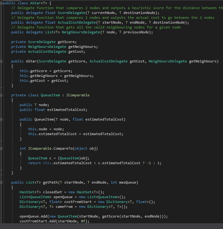
The AStar class accepts any type of object as a graph node. It also doesn’t know anything about the relationship between nodes. Instead it requires that 3 delegate functions are passed in. NeighboursDelegate is used during pathfinding to get all the nodes connected to an already explored node. ScoreDelegate is a heuristic function that informs the direction to look, and ActualCostDelegate computes the true cost of a path.
In my implementations for pipes and rails, NeighboursDelegate builds up a graph on the fly by searching the adjacent locations on the map for empty space. It also takes into account the shapes of building blocks that are available, to know what locations are candidates. For example, tracks use curves that are several units long, so it’s not possible to move a single unit to the left or right.
I also use custom cost functions to do things like preferring straight lines over curves, and preferring to have pipes above the ground so that they don’t obstruct units.
Since implementing this system, tracks and hydrogen have been a lot more fun to build, and have been getting a lot more use in competitive play.